United States Olympics & Paralympics
Team members: Jane Boyton, Xander Vinogradov, Erin Wilson, Chema Leon, Pepe Cacho, Alex Coyle, Chelsea Alexander, Maddy Feeney, Matthew McNerney, Julie Doughty, Tyler Brown, Maddy Feeney, Ling Tuo, Liz Pragel, Michael Vance, and many more animators and design directors from abroad.
USOP approached us wanting to become a more modern brand that was not only more inclusive but had a fresh outlook on sport and unity. The brand was lacking a lot of flexibility and diverse ranges of typography and photography elements. My role within this project was to be able to develop a variety of logos and find typographic pairings that could work for the wordmark. I was also tasked with developing a system that could work for their range of needs as an international sports organization.


Brand Assets
The brand assets first will cover the logo ontop of different new colors from the brand identity. What will follow is the color and the typographic pairings that we leaned into.


Color

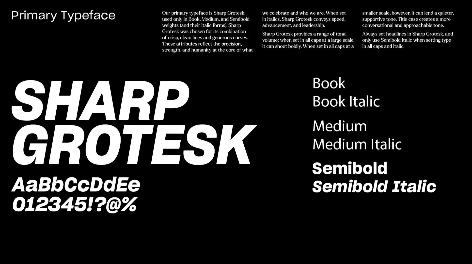
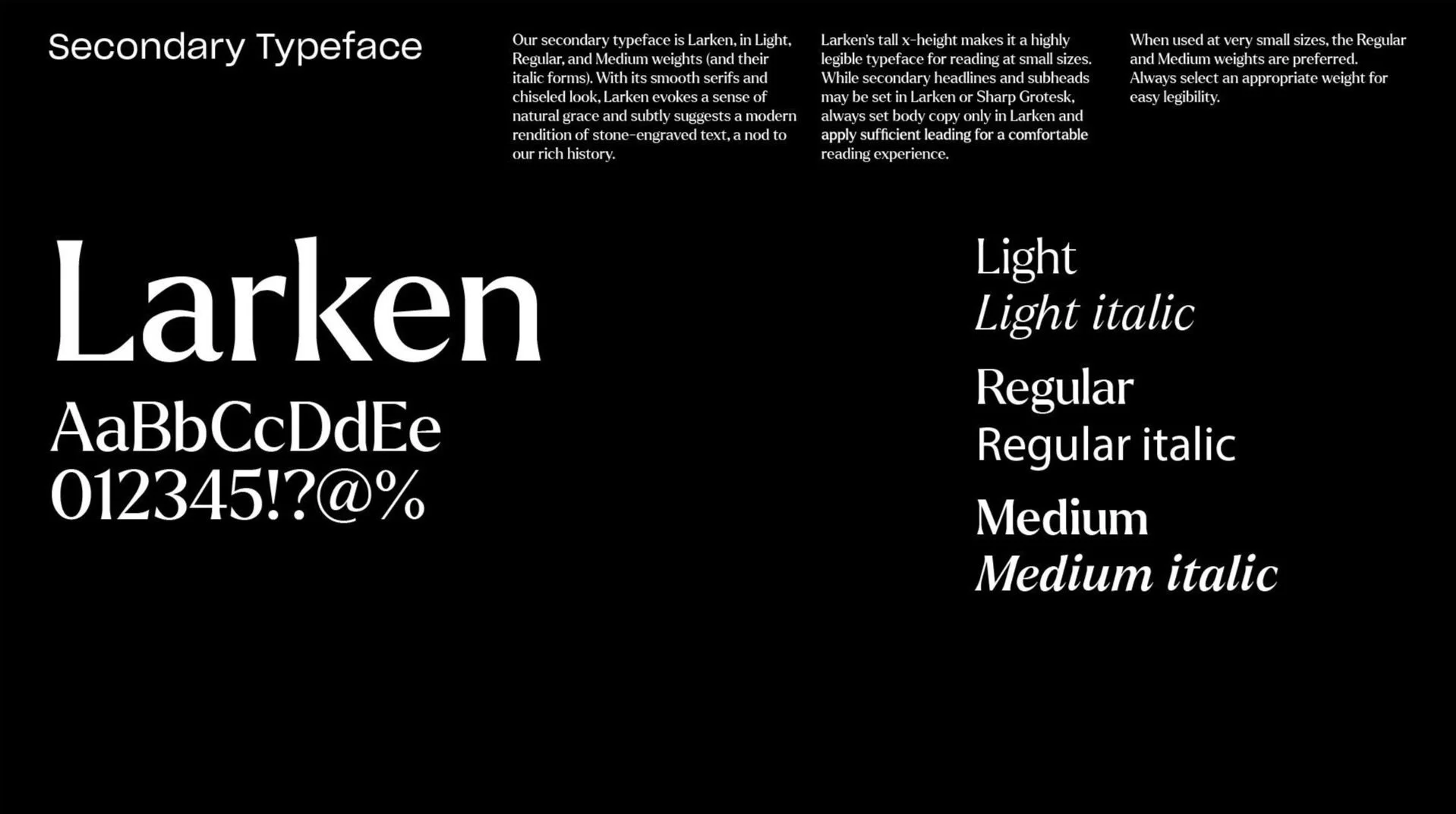
Typography
Brand Identity: The Full Concept

I ended up helping develop this flexible system for the USOP organization. It was created with this scale to help other designers simply execute where the ask is coming from and what to deliver visually. It was imperative that we make examples with the different typographic, and color options to further tease apart the buckets.


Gallery


