Kyndryl
Our team was approached to create a brand identity, name and system for a tech company. How can your team design a brand that speaks to our mission and goals as a growing company in the industry. My role was to design and re-design many of the assets such as the identity and reconfigurations of the logo.
Team members: Xander Vinogradov, Erin Wilson, Chema Leon, Pepe Cacho, Alex Coyle, Chelsea Alexander, Maddy Feeney, Matthew McNerney, Julie Doughty, Tyler Brown, and many more animators and design directors from abroad.
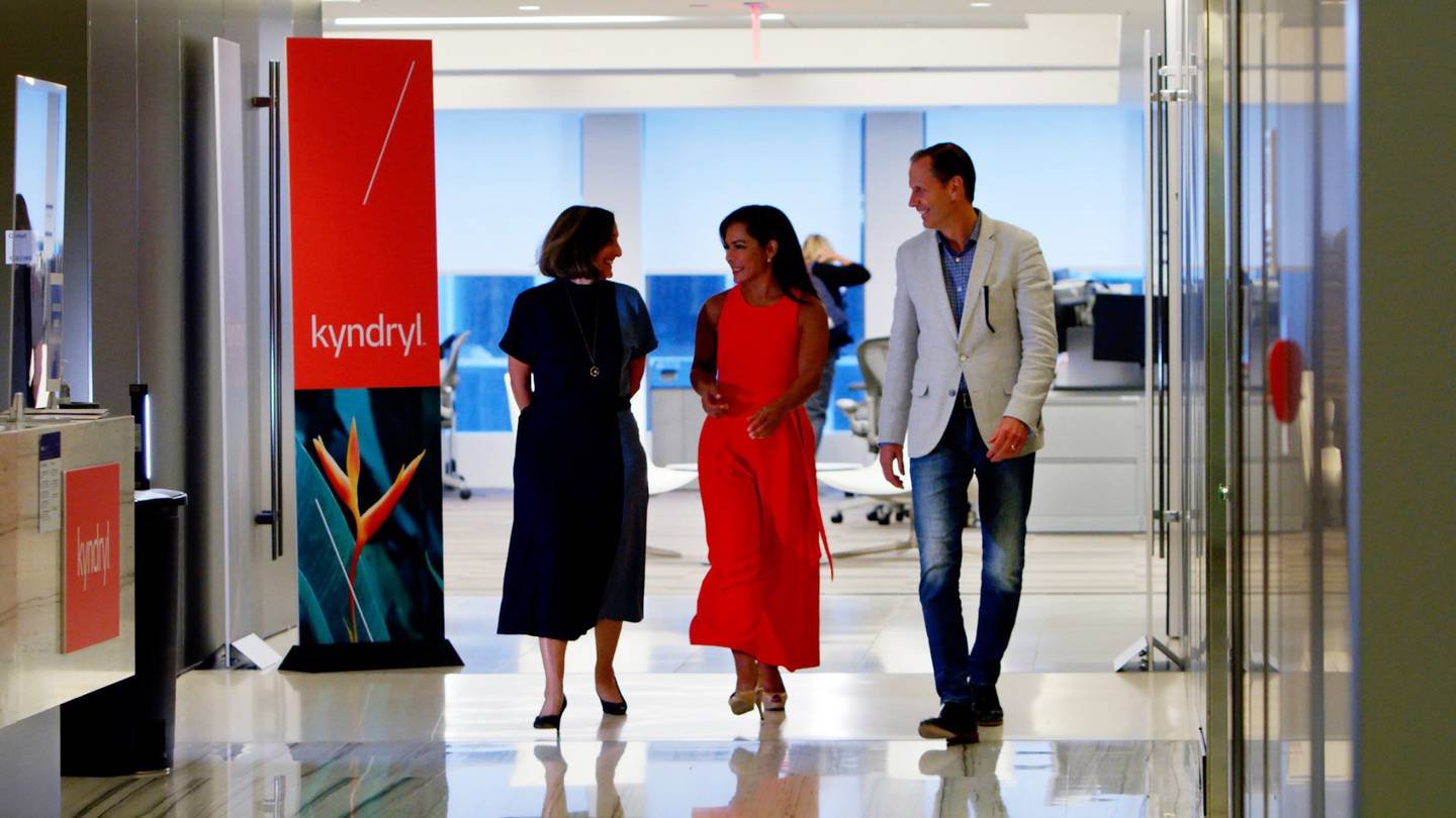
We focused on designing with intent, we used a range of colors that highlighted the growth of kyndryl. Warm tones created that space for them to appear unique and human compared to cold and tech focused. We designed a pattern that acts as the foundation of flexibility and responsiveness to their customers and the ever changing, ever evolving climate we live in.


Overview

Logo
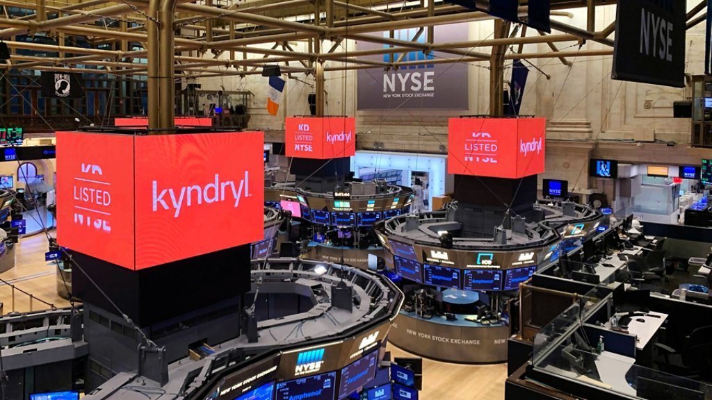
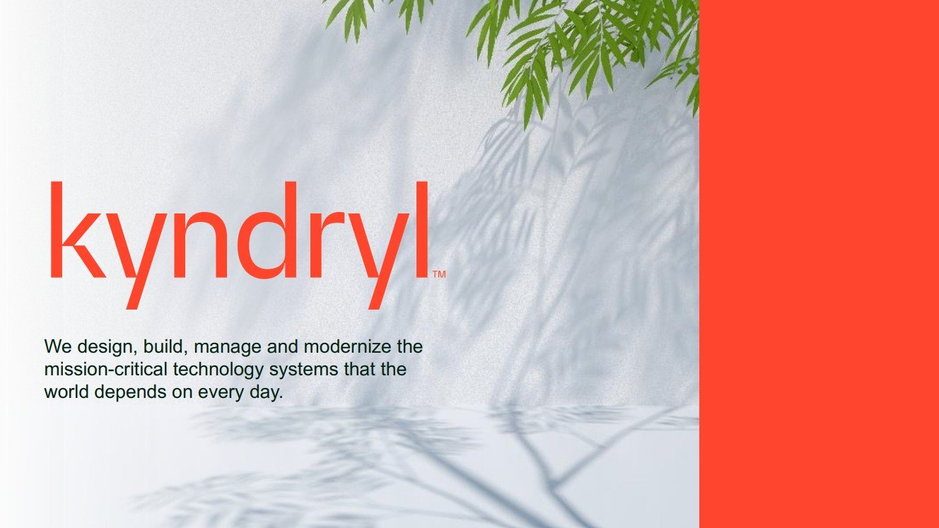
The k of the kyndryl logo emphasizes the line systems we developed. This is meant to tie in connectivity within the divots of the k and unify the concepts of pattern development and technology advancement. The colors we developed were meant to embody a fresh and humanistic approach to technology, so in the following imagery you will see the color and logo interacting.


Gallery


